Before & after
The first screen, side by side
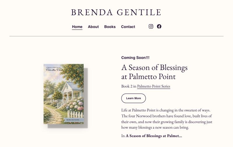
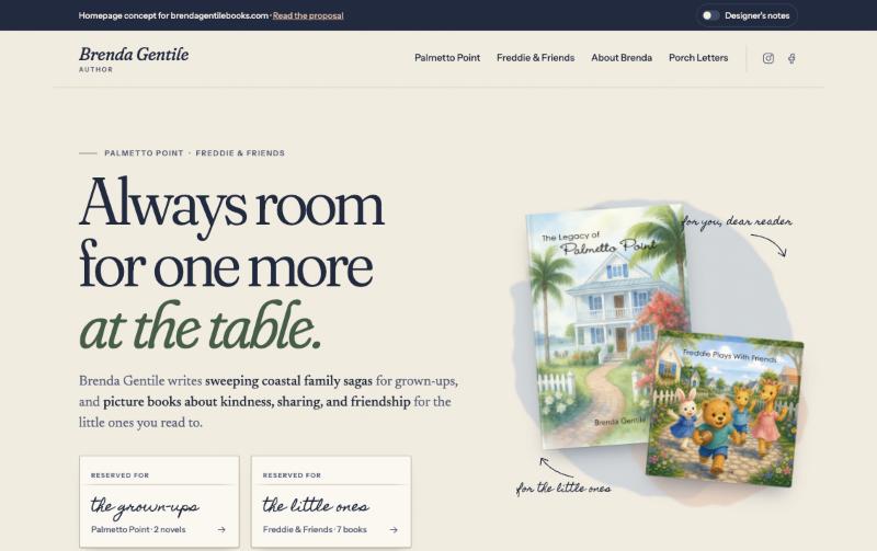
A new homepage for both of Brenda's shelves
Brenda writes for two audiences: readers of coastal family sagas and the families who read picture books aloud. Her current site treats them as one list. This proposal gives each its own seat, and gives every book a way to buy it.
Before & after
What we found
We reviewed the homepage, the Books page, both Palmetto Point book pages and the About page on a phone and on a desktop.
None of the nine books links to a retailer. That's true on the homepage, the Books page and every individual book page.
An adult family saga sits directly above a children's picture book with nothing to separate them. A grandparent shopping for a four-year-old has to work out which books are for whom.
Book Two leads the homepage, but a reader who's excited about it has nowhere to leave an email for release day.
Summaries end in fragments like Palmet…
on the homepage and the Books page, which makes the page look unfinished.
countless hous reading
should read "hours." It's small, but it's the paragraph about Brenda herself.
None of them tells the reader where it leads or what they'll find there.
Sign up for my Newsletter
, Signup for news and special offers!
and Sign Up
. It has no name and doesn't say what readers will get.
Swap in another name and other covers and the layout still fits. Nothing on the page comes from the world of Brenda's own books.
Brenda's photo has empty alt text, so assistive technology skips her picture entirely.
The idea
This line comes from Brenda's own description of Palmetto Point, and the whole homepage is built around it: a Sunday supper with a grown-ups' table and a kids' table.
Every color comes from her covers: the navy of the shutters, the linen, the hydrangeas, the palmetto fronds, the bougainvillea, and Freddie's honey-colored fur. The site looks like it belongs to her books because it was built from them.
What's on the new homepage
"Reserved for the grown-ups" and "Reserved for the little ones." Each reader reaches the right series in one tap.
See itA supper table set with the real family: Keenan, Suzanna, Ben, David, Jerry and Larry, with an empty chair beside each brother. It makes readers want to know who fills them.
See it"Coming Soon!!!" becomes a postcard with a stamp, a postmark and a release-day email sign-up in the address lines.
See itParents pick a lesson (sharing, saying sorry, helping out) and the right book comes off the shelf, with a question to talk about after reading.
See itBooks sit on a wooden shelf and lift when chosen. Name tags introduce Freddie Bear, Larry Lion, Betty Bunny and the rest of the friends.
See itThe bio is rewritten as a first-person letter beside a taped-in photo and signed by hand. The typo is fixed.
See itThe newsletter gets a name, one field and one clear promise. Book clubs, schools and libraries each get a reason to get in touch.
See itA 1:35 trailer for the site and a 30-second vertical cut for Reels and TikTok, set in the cover's watercolor world.
See itDesign system
Palmetto Point
Soft and storybook-like, with a playful italic. One typeface carries both the saga and the bear.
When Keenan Norwood passes away, his four sons come home.
A book face designed for long reading at 18px.
the little ones
Used sparingly, for place cards, the postcard and the signature.
Book Two · Coming soon
Small caps for labels and buttons, kept quiet so the books stand out.
Reference board
These patterns from Mobbin were adapted to Brenda's world; none was copied.
Quality checks
Next steps
What we need from Brenda
Thank you for considering this proposal.
Open the homepage concept Concept and proposal prepared for Brenda Gentile. Book covers and the author photo belong to Brenda Gentile and are used here only to illustrate the proposal. Retailer links in the concept are placeholders.