Website redesign proposal
Academy paper, deep-space night
A new homepage for jcrsmithauthor.com built around one goal: get a reader from “who is this author?” to opening TACE: Year 1 on Kindle, or joining the mailing list, in under a minute.
Before and after
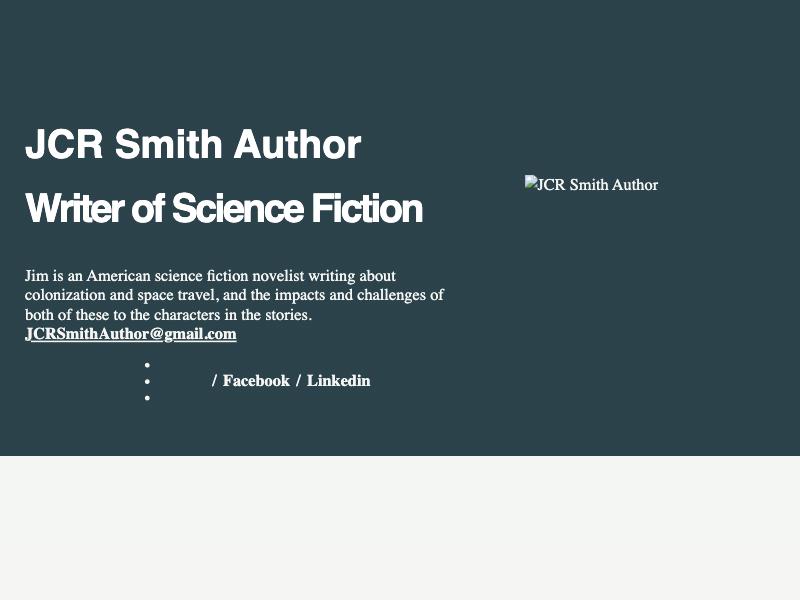
Left: a screenshot of the current homepage, taken 14 October 2026. Right: the proposed homepage, live. Open it full size to try the book rows, the orbit diagram and the signup form.
What the current site gets wrong
From a review of every page on 14 October 2026, ranked by how much each issue costs in sales or readers.
-
High
The newest book isn’t on the homepage.
TACE: Year 1, which Jim calls his best book so far, is only reachable through the Books page. The homepage is a one-sentence bio and an email address.
Fix: TACE leads the page, with its cover and a Kindle button above the fold on desktop and phone.
-
High
Two of the four books can’t be bought from the site.
Benevolence and Escape have no Amazon links. Only the TACE and Conflict of the Realms covers link out.
Fix: Every book gets a labelled buy button. The two missing links are search links until we have the product pages.
-
High
The homepage has no headings.
“JCR Smith Author” and “Writer of Science Fiction” are styled paragraphs, not headings. Screen readers and search engines get no page structure.
Fix: One h1 (the featured book), an h2 for each section, and h3s where needed.
-
Medium
The author photo didn’t load.
In our test browser the hero portrait showed as a broken image. It’s served as a 1.8 MB full-size PNG from the older jcrsmithauthorcom.wordpress.com address.
Fix: Serve resized images from the main domain, with width and height set so the layout doesn’t jump while they load.
-
Medium
Covers have no alt text, and they’re the only buy links.
Those Amazon links have no accessible name, and neither do the photos of Ollie and Dobby.
Fix: Descriptive alt text on every image, and buy links that are text buttons, not bare images.
-
Medium
The navigation shows stray bullet points.
On the homepage, the menu renders as a bulleted list next to “/ Facebook / Linkedin”.
Fix: A single header with four section links and one Kindle button. It stays legible on a 360px phone.
-
Low
Four typefaces with no clear roles.
Urbanist, IBM Plex Sans, Arial and the browser’s default Times all appear. The headline type has no link to the cover lettering.
Fix: Two families, each with a defined job (see the design system below).
-
Low
The signup page doesn’t say what you signed up for.
The button reads “Submit” and the confirmation reads “Thank you for your response. ✨”
Fix: “Subscribe”, a visible label, and specific error and success messages.
- Jim’s own voice in the synopses. The new copy reuses his words wherever it can.
- The TACE cover. Its navy and cream became the site palette.
- A premise built on real astronomy. Trappist-1 exists, and the site now shows it.
- The personal story: Air Force veteran, AT&T engineer, two Cavaliers. It gives his hard SF credibility, and readers remember it.
Five decisions behind the design
Each section of the new homepage exists because it answers a question a reader has before buying.
Lead with the newest book
The hero scales the TACE cover’s own lettering up to page size, with the actual cover beside it. The first thing a visitor sees is the book they can buy.
One page, one way to buy
All four books sit on a single shelf. Each title opens into its synopsis and a Kindle button, so there’s no separate Books page to get lost on.
Make the science the hook
A to-scale diagram of the Trappist-1 system, with planets moving at their true relative speeds. It turns “sci-fi about colonization” into “this place is real, and 40 light-years away.”
Untangle the reading order
Escape is Book II but happens first. A short chronology shows readers where to start, which the current site never explains.
Use the biography as credibility
Ten years in the Air Force and 34 in engineering, laid out like a service record. For hard-leaning SF, that background is a reason to trust the author.
The design system
Most sci-fi author sites use a black starfield. This one starts on paper, like an academy field manual, and only goes dark for the Trappist-1 system, where night belongs.
Titles
Archivo, extra-condensed, 800. Echoes the heavy condensed lettering on the covers.
Labels and wordmark
Archivo, expanded, 600. The same family at a wider width, so it reads like aerospace livery.
Reading
Literata, upright. Designed for e-book reading, which suits a Kindle-first author.
No italics, no gradients on text
Emphasis comes from weight and width, never from slanted or glowing type.
Circles mean worlds
Only the planets, the orbit diagram and the dogs’ portraits are round. Everything else is square.
Book colors stay with their books
Each title takes its own cover color when opened: oxide for Benevolence, cobalt for Escape, gold for Conflict.
What we borrowed, and what we left out
We studied how shipped sites on Mobbin handle each of these sections. We borrowed structure, not looks.
| Reference | Borrowed | Left out |
|---|---|---|
| MasterClass Newsroom | A huge condensed headline with the image overlapping it, used for the TACE hero | Stock photography and the accent rule |
| A24 film index | Titles set as a stacked list of giant type, with small metadata beside them | The stark white and a hamburger-only menu |
| Waka Waka index | Ruled catalog rows with aligned columns, used for the chronology and service record | SKU-style N°0001 numbering |
| Faculty Department | Books treated as physical objects, with real light and shadow | Lifestyle photography we don’t have |
| Grok | One real diagram as the space moment, instead of starfield wallpaper | Black everywhere and thin gray type |
| In Common With | A split newsletter block with a visible label and one field | Placeholder text standing in for the label |
Questions for Jim
Answers to these finish the content. Nothing here blocks the design.
- What are the Amazon product links for Benevolence and Escape? They’re search links for now.
- Do TACE and Galactic Equilibrium share a universe? Both mention the Thean. If they do, the shelf can group them.
- Are paperbacks or audiobooks available, and what are the release dates?
- Are there reader reviews or endorsements we have permission to quote?
- Should the newsletter stay on WordPress.com subscriptions, or move to a dedicated email service?
- Is the tricolor Cavalier Ollie and the chestnut-and-white one Dobby? We followed the order on the current About page.
How we’d ship it
The site can stay on WordPress.com. Custom fonts and CSS depend on the plan, so we’ll confirm the plan first.
Phase 1
Homepage and fixes
- The new homepage, as shown here
- Headings, alt text, buy links
- Resized images from the main domain
Phase 2
A page per book
- Shareable URLs for ads and social posts
- Search titles and descriptions
- Formats and editions once known
Phase 3
The research archive
- Worldbuilding notes from the newsletter
- Tech explainers per series
- Signup on every post