Three things change
The first five seconds
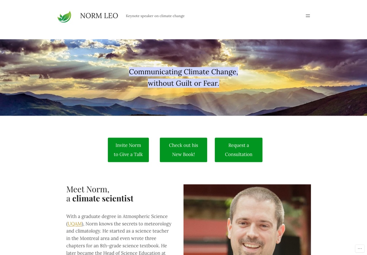
What’s holding it back
| Impact | Finding | Fix in the concept |
|---|---|---|
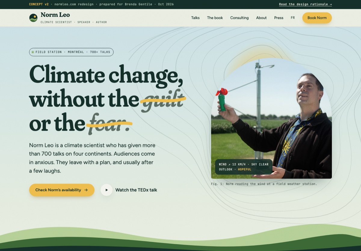
| High | The first screen is a stock sunset photo. Norm doesn’t appear until you scroll, but people book a person. | Hero photo of Norm at a weather station, plus a scientist “data readout” tag. |
| High | Three identical green buttons (talk, book, consultation) compete, so no single next step stands out. | One primary action (“Check Norm’s availability”), repeated in the sticky header and a mobile bar. |
| High | The contact form has only name, email and message. Planners end up emailing back and forth about date, audience and topic. | A booking form with request type, date, audience size and topic. Topics prefill from each talk’s “Request” button. |
| Medium | The default theme (Lora everywhere, stock #009620 buttons) has no visual link to the book or to Norm’s message. | A custom system based on the book cover’s tall type and sunlit greens and yellows. |
| Medium | Credentials (700 talks, TEDx, 6 countries) are buried in paragraphs, and media coverage only appears at the very bottom. | A stats bar and a “Heard on” strip directly under the hero. |
| Medium | Topics are a plain bullet list with no description, audience or way to request one. | A numbered keynote list with audience tags and a request button on every talk. |
| Medium | As of today, 5 of the 6 events in “Talks & Interviews” are in the past and look the same as upcoming ones. | A calendar with a “Next up” highlight and dimmed past events. |
| Medium | Content images have empty alt text, so screen readers skip Norm, the book and the guide. | Descriptive alt text, a skip link, visible focus, labelled fields and reduced-motion support. |
| Low | The homepage footer shows WordPress artifacts: “Proudly powered by WordPress”, a comment box, and visible “← Back” / “Thank you ✨” form text. | A purpose-built footer that ends with a booking prompt and a big “Look at it this way.” |
“Turn it over”
Norm’s book has two covers. One side says climate change impacts will harm your health and wealth, over cracked, dry earth. Turn it over and climate change solutions will benefit your health and wealth, over a sunlit meadow. That’s his whole method, so the website uses the same move. Each signature moment is a small flip from fear to payoff:
A landscape at first light
The hero is a dawn sky with topographic contour lines, a rising sun and layered hills (fern, moss, forest). Norm stands in an arch window, and a hand-drawn sunlight stroke crosses out “guilt” and “fear”.
The unwritten stripes
Warming stripes from 1900 to 2025 (blue to red), followed by 25 blank years. Clicking “Look at it this way” fills them with greens and gold, and sprouts grow above the band. It visualizes his message without a lecture.
Dry season → new growth
Health, Wealth, Food, Water, Home: the book’s five chapters. The front is cracked, dry earth (the problem). The back is leafy green (the payoff), with real numbers from Norm’s free guide.
A book you can turn over
The book really is a flip book: one cover reads “Climate change impacts will harm” (dead tree, cracked earth) and the other reads “solutions will benefit” (sunlit tree, green grass). The 3D book turns between the two real covers, with a live “harm / benefit” indicator. The free guide appears as a clip-out coupon, matching the scissors-and-price-tag style Norm already uses in it.
Field-notes details
Isobar lines (weather-map pressure contours), weather-station readouts, “Fig. 1” captions, leaf-sprout bullets and a soft paper grain. These say “atmospheric scientist outdoors”, not “eco template”.
Built for planners
Sticky “Book Norm”, a mobile booking bar that hides near the form, prefilled topics, a 3-step “what happens next” list and a media kit link.
From the forest floor to the open sky
#15302A
#3D6B37 · #8DB36B
#CFE4E9 · #EEF1E6
#F2C14E
#EBDDC3 · #9C4A24
data only
Display. Set to its “soft” and “wonky” axes so the letters feel grown rather than machined, with an italic for the hopeful half of each headline.
Body text. Friendly and open, and readable on any screen.
Labels, dates and figure captions: the scientist’s notebook voice.
Shapes come from nature: arch-window photos, a leaf-shaped frame, hill-horizon section dividers, pill buttons and 20–28px corners. There’s no glassmorphism or neon-green gradients. All text meets WCAG AA contrast, and sunlight yellow is only ever paired with forest green.
What we borrowed, and from where
Each section started from real shipped websites on Mobbin, not from a template. Here is what each one contributed:
Moss-macro photography and a soft serif wordmark. Proof that “environmental” can feel calm and premium, not preachy.
Small mono labels in outlined pills over a natural scene. These became our “field station” tags.
Its “Annals of a Warming Planet” solar landscape. Sunlight as the colour of hope gave us the gold CTA and sun glow.
A rounded quote card beside an outdoor portrait. That informed the testimonial layout and leaf-shaped frame.
“Sustainability must be measurable”: big honest numbers. That’s our 700+ / 6 / 20+ / TEDx stats band.
A big editorial headline on the left with the people on the right. We adapted it with one photo and a stronger single CTA.
A candid photo next to condensed caps and a quiet button. Proof that condensed type can feel warm.
Event rows with a city tag, date stack and big title. We kept the rhythm and added “Next up” and dimmed past rows.
A ruled “Event / Where & when” table. This became the structure for both the talks list and the calendar.
A large physical book next to a dark panel of specs. We used the object-first presentation on a dark background.
Cover-centric and restrained, with just “Buy | Read”. That’s why the book gets two buttons and no clutter.
One oversized serif pull quote. We made Nancy Chenier’s “guardians of our beautiful blue planet” the hero quote.
A framed portrait paired with a quote. We turned it into a tilted “FIG. 3” print next to the testimonials.
- v2 style: “Organic Biophilic” (rounded organic shapes, natural textures, flowing SVG, nature green with solar gold). We followed its anti-pattern warning (“greenwashing, no real data”) by grounding every green moment in real data: the warming stripes and the guide’s savings figures.
- Kept: the Event/Speaker landing pattern (credibility early, CTA after the speaker info and at the bottom, sticky booking), JetBrains Mono for data labels, a spacious density scale, staggered scroll reveals and reduced-motion handling.
- Replaced in v2: v1’s editorial and brutalist look (hard rules, condensed caps) felt too urban for a climate message, so it gave way to biophilic forms.
- Rejected:
stock emerald #059669 on mint,Fira Sans/Code,academic navyandExo. They’re generic eco and science defaults. The palette comes from Norm’s own field photo and book cover instead.
Already built into the prototype
- Responsive from 375px to 1440px with no horizontal scroll
- Keyboard support for every flip card, the book and the stripes (aria-pressed)
- Decorative contours, hills and grain are aria-hidden SVG and CSS, with no image weight
- Skip link and visible yellow/ink focus rings
- Labelled form fields with inline errors next to the field
- prefers-reduced-motion: all motion off, final states shown
- Touch targets of 44px or more, with a mobile sticky booking bar
- Images lazy-loaded and sized to prevent layout shift
- SVG icons only, no emoji icons
- Descriptive alt text on every content image
- Bilingual entry point (FR) kept in the main nav
From concept to live site
Review
- Walk through the prototype with Norm
- Pick the hero photo and confirm tone
- Lock the five card lines with text from the book
Build
- Custom WordPress block theme (keeps his current hosting and editor)
- Booking form connected to his inbox
- French version mirrored at /fr/
Launch
- Redirects for existing URLs
- SEO meta and FAQ schema (his FAQ already targets good queries)
- Analytics on “Book Norm” clicks
What we need from Norm
- VideoTEDx Vancouver YouTube link (the prototype uses a placeholder)
- BookExact Amazon URL, plus high-res files of both covers (we have the “harm” side at web size only)
- PhotosHigh-res originals, especially the weather-station shot and a stage shot
- SocialHandles for YouTube, LinkedIn, Instagram, TikTok, X and Bluesky
- EventsCities and roles for upcoming dates (two currently show “TBA” or “—”)
- ProofOrganization names for testimonials, plus any client logos he can use