Lead like a film release
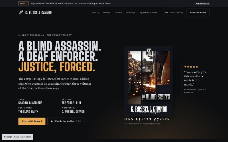
The Shadow Guardians open the page as a poster: a three-line headline, a credits block, the Book I cover, one reader quote, and the trailer a click away.
From Siena Film Foundation and NEON
Website redesign proposal · grussellgaynor.com
G. Russell Gaynor writes the heroes the genre usually sidelines: a blind assassin, a deaf enforcer, an African order of Protectors older than the pyramids. His current site, built on a UENI template, buries that under stock photos, unexplained menu codes and a headline that is invisible on a phone. This proposal sets out what we found, the direction we recommend, and a working homepage concept built from his real covers, loglines and reader reviews.
Summary
Ten problems on the live site. Two are critical: the hero headline disappears while the page loads, and pinch-zoom is switched off for every visitor.
2 critical4 high3 medium1 low
Rebuild the site around the Shadow Guardians as a film-style release, with a library that lists every book by world in reading order, and accessibility that matches the values in the books.
A faster site he owns outright, every book one tap from Amazon, a newsletter that builds his own reader list, and a home for speaking requests.
Audit of the live site · checked 12 October 2026
Checked at 1440 px and 375 px in a current Chromium browser. Severity reflects how many visitors are affected and whether it stops them reading or buying.
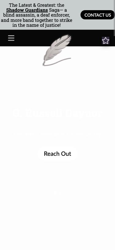
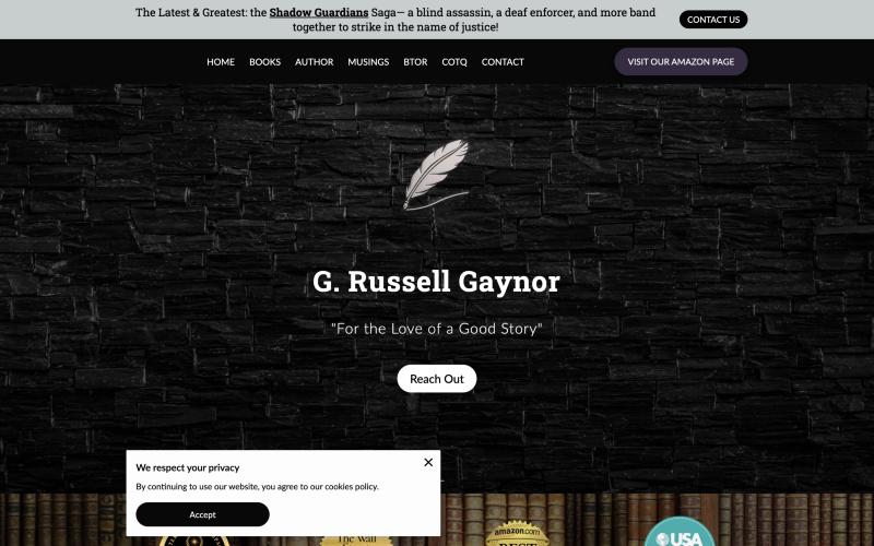
His name and tagline are white text on a near-white ground. They only become readable once the stone-wall background arrives. On a phone, the first screen is a white page with a quill and a faint button.
Fix: a solid dark ground that renders instantly, with real text over it and no background photo behind the headline.
The page sets maximum-scale=1.0, user-scalable=no. Low-vision readers can’t enlarge text on their phones, which fails WCAG 1.4.4 (Resize Text). For an author whose heroes are blind and deaf, it is also the wrong message.
Fix: a standard viewport tag, plus an “Easier reading” switch in the header.
The announcement bar’s “Contact us” button runs off the right edge of the screen, and the quill logo hangs over the menu bar.
Fix: a compact header with the name, an “Aa” reading switch and a Menu button, all at least 44 px tall.
The homepage HTML alone is 2.3 MB before a single image, and the Books, Musings and BTOR pages are 1.1 to 1.3 MB each. The template also loads a map style file on every page.
Fix: a static build with a budget of under 1 MB per page including images, and compressed cover files.
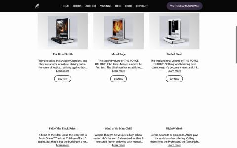
Every description is cut mid-sentence (“striking against those who …”). The covers are small 3D mockups on grey, so titles are hard to read. Nothing tells a new reader that The Blind Smith comes before Muted Rage.
Fix: a library grouped by world, in reading order, with full loglines, flat covers and a buy link on every row.
“BTOR” and “COTQ” are not explained anywhere. BTOR turns out to be Beyond the Outer Rim; COTQ leads to the SylverQuill Press catalog and submission guidelines.
Fix: plain labels: Books, Worlds, Author, Musings, SylverQuill Press.
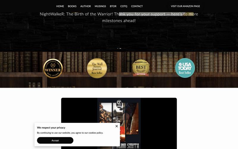
The USA Today, Wall Street Journal, Amazon and Impact Book Award seals are small clip-art over a bookshelf photo, below the fold. Meanwhile the hero rotator repeats the same award slide three times.
Fix: the award in a slim bar above the header, and a typeset recognition strip directly under the hero.
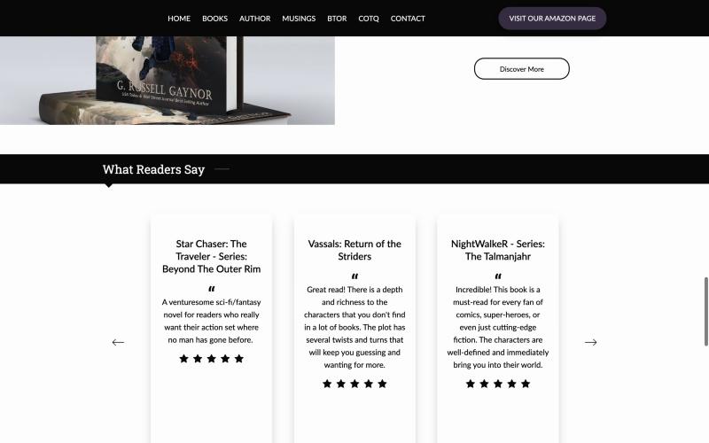
“A venturesome sci-fi/fantasy novel…” is credited to Kirkus Reviews on the BTOR page but appears without a source in the homepage “What Readers Say” carousel. The review cards also have large empty areas below the stars.
Fix: one large quote at a time, always with its source. Trade reviews like Kirkus get named.
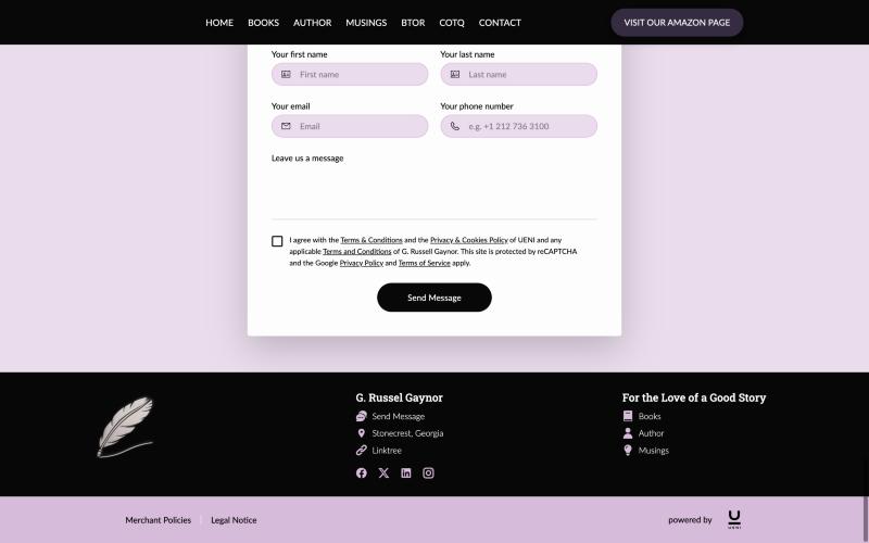
The footer spells his name “G. Russel Gaynor”. The contact section switches to a lavender palette that appears nowhere else. The form’s consent line lists UENI’s terms before his own.
Fix: one palette and one voice from the header to the footer, with his own privacy notice.
Contact links go to grussellgaynor.ueniweb.com instead of his own domain, which splits search ranking and looks like a different site.
Fix: every link on grussellgaynor.com, with 301 redirects from old addresses.
Direction
The Forge Trilogy covers already have a visual language: graphite, silver chrome lettering, molten sparks and three vertical panels. His logo is a silver quill, and his press is SylverQuill. We built the site from those materials, so it looks like his books and not like a template.
The one bold moment is the hero, where sparks rise behind the Book I cover. Everything after it is quiet and built for reading.
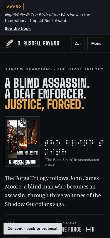
The Shadow Guardians open the page as a poster: a three-line headline, a credits block, the Book I cover, one reader quote, and the trailer a click away.
From Siena Film Foundation and NEON
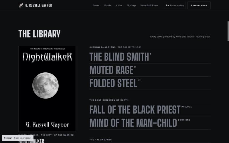
Every book is listed by world, in reading order, as large type. On a laptop, choosing a title swaps the cover and logline beside it. On a phone, each row shows its own cover and buy link.
From A24 and Faculty Department
Zoom always works. “Easier reading” switches body text to Atkinson Hyperlegible, the typeface the Braille Institute designed for low-vision readers. The hero prints The Blind Smith in real braille.
WCAG 2.2 AA throughout
Before and after
Mobbin references
We searched Mobbin for film, publishing and review patterns rather than other author sites, which mostly share the same template problems. Each reference supplied one idea, not a look.
| Reference | What we took | Where it lands |
|---|---|---|
| Siena Film Foundation | Film-poster hero: a large title, a credits block, and a column of acclaim beside the image | Homepage hero |
| A24 | A catalog shown as an oversized title index, with small superscript metadata | The Library, with volume numbers as superscripts |
| NEON | Condensed poster type at very large sizes | Display type scale |
| Faculty Department | Books shown as objects with quiet captions and plenty of space | Cover presentation and preview panel |
| Public | One large quote at a time, with its source, and no card around it | Readers section |
| VanMoof | Section label on the left, quote on the right, small previous and next controls | Review controls |
What we left out on purpose: rows of three icon cards, stock bookshelf and outer-space photos, carousels that advance on their own, gradient buttons, and pastel form sections.
Design system
#0D0E11 Page ground#16181D Raised bands#D9DCE2 Text, the SylverQuill silver#979DA9 Secondary text, 7.1:1 on Forge#F2A541 The only accent: sparks, award, focus#E7E9EC Reading band, cool rather than creamJustice, forged.
Big Shoulders DisplayTitles, credits and the library index. Its condensed, industrial letters echo the chrome lettering on the Forge Trilogy covers.
William thought he was just a high-school senior.
LiterataLoglines, quotes and long reading. It was designed for long-form reading in Google Play Books.
Buy on Amazon · Easier reading
Atkinson Hyperlegible NextLabels, buttons and the Easier reading mode. The Braille Institute designed it so similar letters can’t be confused.
How we used ui-ux-pro-max
We ran its design-system search for a fiction author with a cinematic, editorial brief. We kept its rules: 4.5:1 text contrast, visible focus, reduced-motion fallbacks, 44 px touch targets, and checks at 375, 768, 1024 and 1440 px. We kept its editorial-serif reading direction. We dropped its default black-and-pink palette and Swiss-minimal style as too generic for this author, and replaced them with colors taken from his covers.
Site map
| Today | Proposed | What changes |
|---|---|---|
| Home | Home | Poster hero, recognition strip, library, worlds, trailer, readers, musings, author, sign-up |
| Books | Books | Grouped by world in reading order, plus a page for every book: cover, logline, series position, formats, retailer links, reviews, trailer, next in series |
| BTOR | Worlds | Each world named in full, starting with Beyond the Outer Rim, with its glossary |
| COTQ | SylverQuill Press | The press, its authors, services and short-story submissions |
| Author | Author | Biography, speaking topics, press photos and a downloadable press kit |
| Musings | Musings | Posts tagged Craft, Industry and Author life |
| Contact | Contact | Separate routes for readers, speaking requests and press |
Plan
Collect flat cover files and retailer links for every book, confirm series order, write full loglines, choose the newsletter service.
Finalize tokens and design the homepage, book page, world page, author page and Musings article.
A custom static build on hosting the author owns. Move every Musings post across and set 301 redirects from each old address.
WCAG 2.2 AA audit, a performance budget of under 2.5 s to show the main content on 4G, analytics and Search Console.
The timeline assumes content arrives in week 1. Fees are quoted separately.
Next step