The short version
The good material is already there. The template hides it.
- IJoseph has real proof
A Kirkus review printed on page 166 of the January 1, 2026 issue, a BookFest Awards third place, striking cover art, 15 journal entries, and three projects in the works. Most indie author sites would kill for that list.
- IIThe current site buries it
The review and award are printed with raw web addresses. Buying takes an extra click through a dropdown, and blog previews show stray HTML code like
. The look is a stock template with no link to the book. - IIIThe redesign starts from the cover
Colors are sampled from the dragons and the dusk sky. The type feels like a printed chronicle, and the page is ordered by the questions a new reader actually asks, from "what is it?" to "is it good?" to "where do I buy it?"
01Audit
What's on the site today
Reviewed on desktop (1280px) and mobile (375px) on October 12, 2026. The site runs on the Tertulia author-website builder.
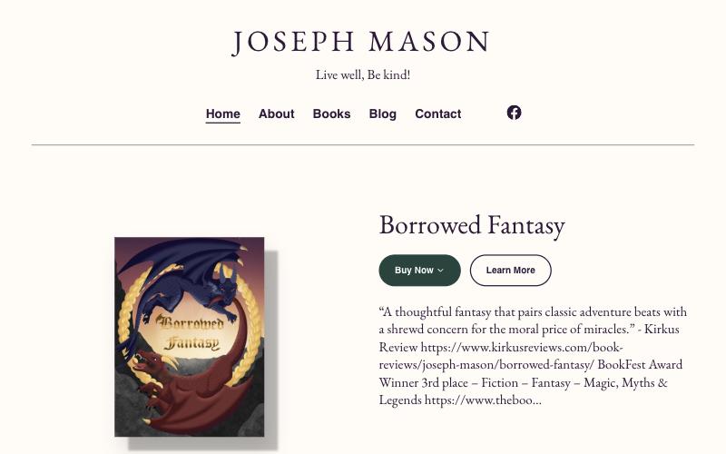
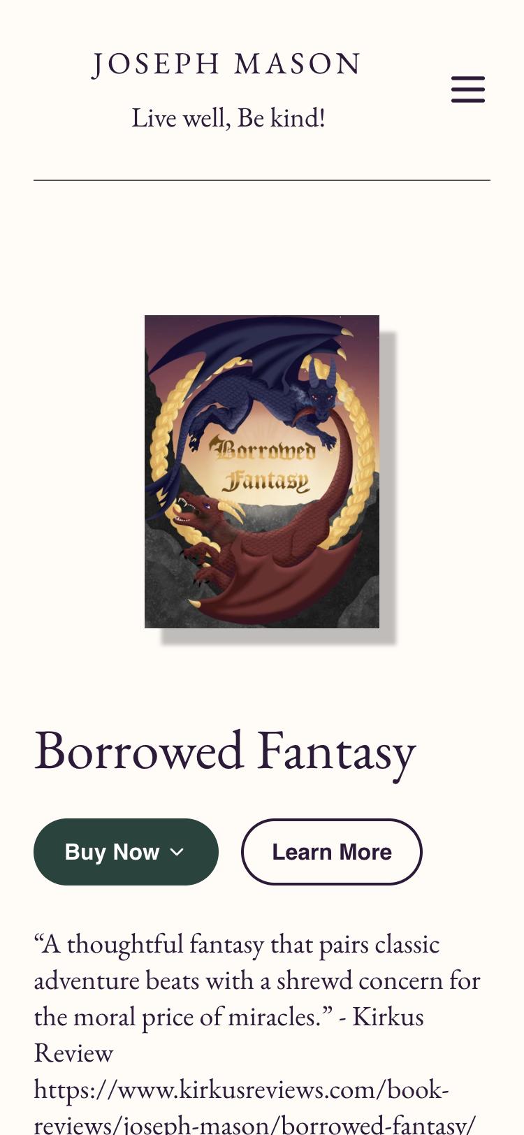
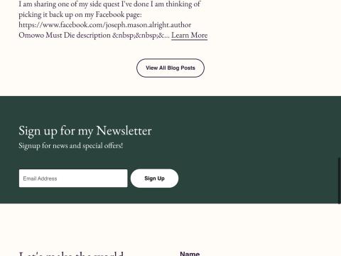
&… above a generic newsletter band.| # | Finding | Fix in the redesign | Impact |
|---|---|---|---|
| 1 | The two best credibility signals look broken.The Kirkus quote and BookFest award are plain text followed by raw URLs, one of them cut off (https://www.theboo…). | The Kirkus quote becomes a full-width feature set as a "p. 166" clipping with a linked source. The award gets its own laurel row. | High |
| 2 | Blog previews show HTML code.For example: Omowo Must Die description &… | The journal becomes a clean index with date, title and topic tag, and no auto-generated excerpts. | High |
| 3 | A stock template with no link to the book.Cream and forest green with EB Garamond and Helvetica nav, nearly the same as other Tertulia sites. Nothing echoes the dusk-and-dragons cover. | The palette is sampled from the cover, and the type is IM Fell English with Literata (see Direction). | High |
| 4 | Buying takes an extra step."Buy Now" opens a dropdown before showing Amazon or Barnes & Noble. | Both retailers get direct buttons in the hero and again after the synopsis, plus a "Buy the book" button in the sticky header. | Medium |
| 5 | The homepage has no H1.The first heading is "About Joseph Mason" (H2), and the book title isn't a heading at all. | Borrowed Fantasy becomes the page H1, with a clean H2/H3 outline below it. | Medium |
| 6 | Vague links.There are five identical "Learn More" links, and the Facebook icon link has no accessible name (fails WCAG 2.4.4, link purpose). | Links say where they go, for example "Read the full review", "Read Joseph's full story" and "Read all 15 entries". Facebook is a labeled text link. | Medium |
| 7 | What's next is hidden in blog posts.It's Always the Red Dragon, Avoiding Fate and Omowo Must Die appear only in posts. | A new "On the writing desk" ledger lists each project with its status, and the newsletter promises news of the Red Dragon. | Medium |
| 8 | The newsletter gives no reason to join.The only promise is "news and special offers". | "Hear first when the Red Dragon lands" comes with a specific promise, inline validation and a confirmation state. | Medium |
| 9 | Weak sharing and search setup.The share image is the headshot, not the cover. There's no Book structured data, and the meta description is generic. | The cover becomes the share image. Book schema adds the ISBN, award, review and retailers, and the description names the book and its awards. | Low |
| 10 | The age note is buried."Contains fantasy violence!!! Please read before sharing with kids under 13!" sits inside the description. | A calm "Reader note" sits right next to the buy buttons, where parents decide. | Low |
| 11 | A truncated bio.The homepage excerpt stops mid-word: "Finding a place in Cust…" | The bio is written for the homepage, with a timeline of Joseph's path. | Low |
02Direction
A dusk-lit chronicle
Every choice comes from the book itself, not from a template. That's what keeps it from looking AI-generated: swap in another author's name and the design stops fitting.
The cover's sky is the page, and its gold rope ring is the only ornament. Everything else is set like a well-made hardback.
Palette, sampled from the cover
#16152BThe blue dragon's shadow side. Used for the hero and footer.
#4B2A47 → #F0C08AThe sky behind the title. Used only on the hero horizon.
#F3ECDFPage color, with a faint paper grain.
#1D1B2CBody text, 14.4:1 on parchment.
#8C2B21The red dragon. Used for buttons on paper, 7.2:1.
#D9AE55The ring. Used for ornaments and buttons on night, 8.6:1.
#4A4453The rocks. Used for the mountain ridge that closes the hero.
Type
Display · IM Fell English
Borrowed Fantasy
Text · Literata
Levi went out to face the threat to their hidden village and never came back. Now his younger brother, Abram, has to follow the same trail.
Signature details only this author could have
- The "p. 166" folio
Kirkus ran Joseph's review on page 166 of the January 1, 2026 issue, so the review is set as a clipping from that page with the folio number. The fact comes straight from his own journal.
- The rope ring
A thin gold ring, beaded like the braided rope on the cover, draws itself once around the book on load. It's switched off for visitors who prefer reduced motion.
- The trail
The book is "a trail into a nightmare world," so its three parts step further out across the page. Joseph's bio timeline is drawn as a dashed trail ending in a red marker.
- The ridge line
The rocks from the bottom of the cover become the mountain silhouette between the dusk hero and the parchment page.
- His own voice
"Live well, Be kind!" closes every page in large italic. The journal keeps his exclamation marks, and the portrait caption borrows his joke about not missing a modeling career.
How the UI/UX Pro Max design-system pass was used
We generated a baseline system for "fantasy author book website" and kept what fit:
- Kept: the "proof before the call to action" pattern (Kirkus and award sit between the synopsis and the second buy buttons), the warm book palette, the serif-on-serif literary pairing, spacious density, and the pre-delivery checklist: 4.5:1 contrast, visible focus states,
prefers-reduced-motion, and checks at 375 / 768 / 1024 / 1440px. - Changed: the suggested brown and amber palette became colors sampled from Joseph's actual cover. The suggested Cormorant Garamond / Libre Baskerville pairing (very common on author sites) became IM Fell English / Literata.
- Rejected: the "Swiss Modernism" style and the testimonial carousel. Joseph has one excellent review, and a carousel would dilute it.
03Structure
The homepage, ordered by what a new reader asks
What is this book?
Hero: title as H1, the cover, a two-sentence hook, and direct retailer buttons.Is it any good?
The Kirkus "p. 166" clipping and the BookFest laurel.What's it about?
The three parts on a widening trail, a reader note, and buy buttons again.Is there more coming?
"On the writing desk": the Red Dragon and two side stories, with status stamps.Who wrote it?
Portrait, a short bio, and the engineer → officer → novelist trail.Is he active?
Journal index by year, with dates, titles and topics.How do I hear first?
A newsletter "letter" with a concrete promise and clear states.Can we invite him?
An events request form with visible labels and inline errors.
04References
What we borrowed from Mobbin, and what we left behind
Patterns from real, well-designed sites, adapted to Joseph's book rather than copied.

Faculty Department
Borrowed: treating the book as a physical object on a dark, lit stage. Left: the photography, since the cover art is the star.

Craft
Borrowed: one large italic serif quote with a laurel award mark. Changed: left-aligned with the "p. 166" folio instead of centered.
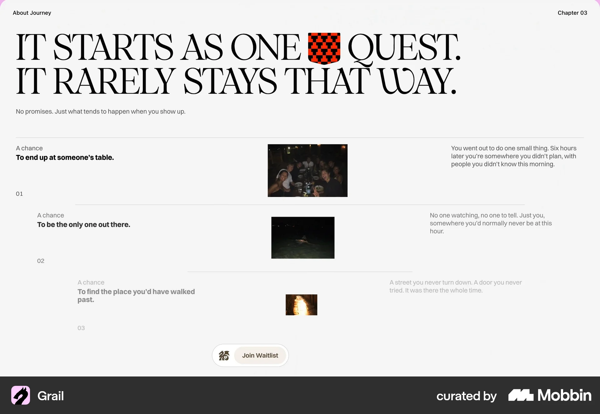
Grail
Borrowed: numbered stages that step diagonally across the page. It became the three-part trail of Borrowed Fantasy.
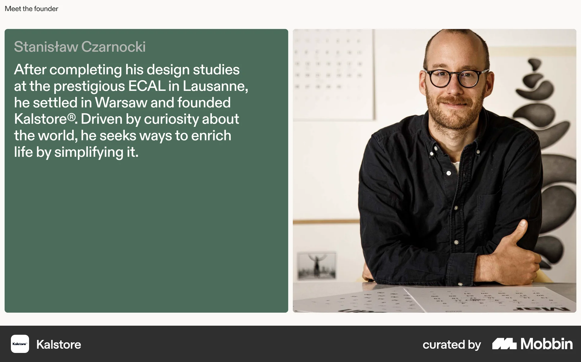
Kalstore
Borrowed: a large bio statement beside an honest portrait. Added: the career trail, and a print-plate frame so the white studio backdrop sits naturally on parchment.

In Common With
Borrowed: a ruled index of entries instead of blog cards. It's quick to scan and has no broken excerpts.
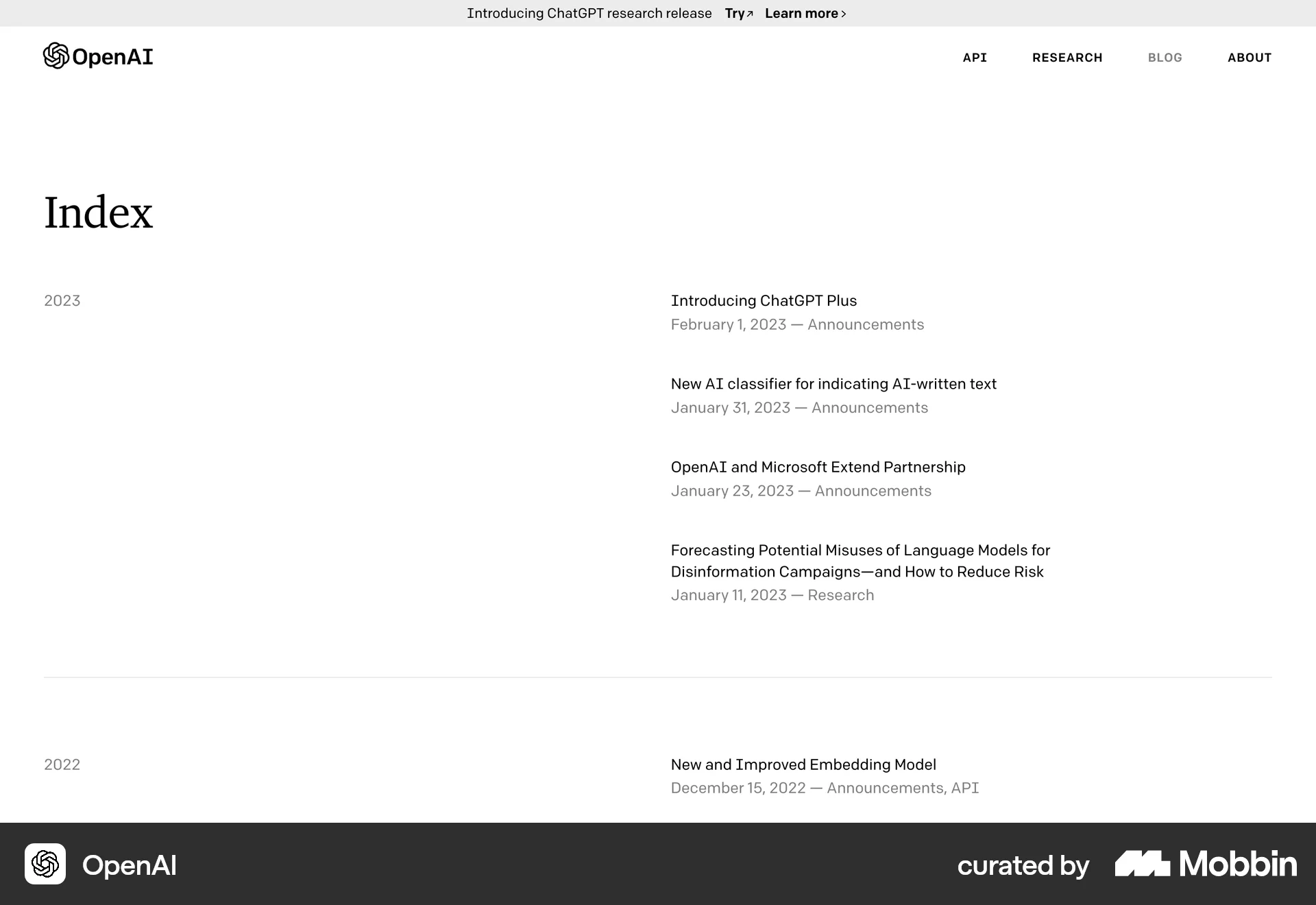
OpenAI Index
Borrowed: the year in its own column, so the journal reads like a chronicle as entries pile up.

Teak
Borrowed: the tab label on the newsletter panel. Here it becomes a parchment letter, "Letters from Joseph," resting on the night sky.
05Prototype
The homepage, working
Scroll inside the frames, or open it full screen. The forms validate and show confirmation states, but nothing is sent.
06Next steps
What we'd need from Joseph
Questions to confirm
- Part titles. The three part names in the prototype are drafted from the current synopsis. Swap in the real ones if the book has them.
- Formats and retailers. Should Kindle, paperback, hardcover, audiobook, Bookshop.org or signed copies get their own buttons?
- Newsletter. Which email service should signups go to, and how often will letters realistically go out?
- Events. Is he open to in-person, virtual, or both, and does he travel?
- Platform. Can Tertulia's theme options handle custom fonts, colors and sections, or should we move to a custom-built site? We'll check before quoting.
Proposed scope
- Homepage (prototype included)
- Book page for Borrowed Fantasy, ready to template for the Red Dragon
- About page with full story and press kit (headshot and cover downloads)
- Journal index and article template
- Talks & events page with request form
- Newsletter thank-you, 404 and empty states
- SEO: Book schema, share images per page, redirects from current URLs