Before and after

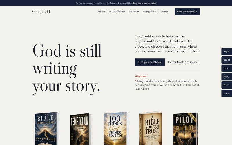
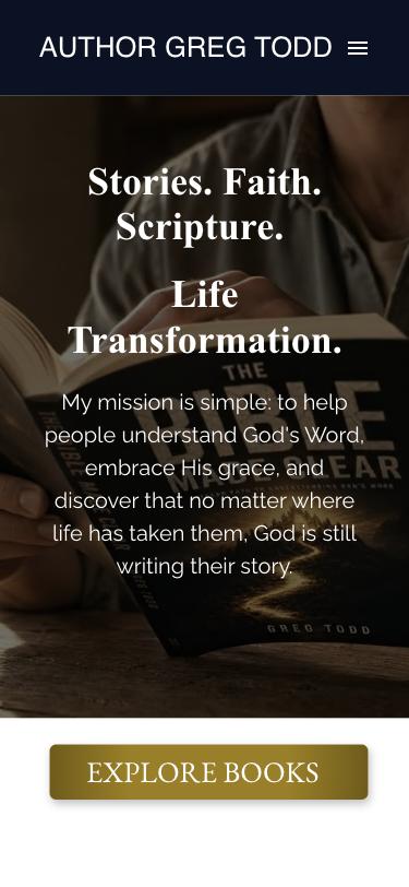
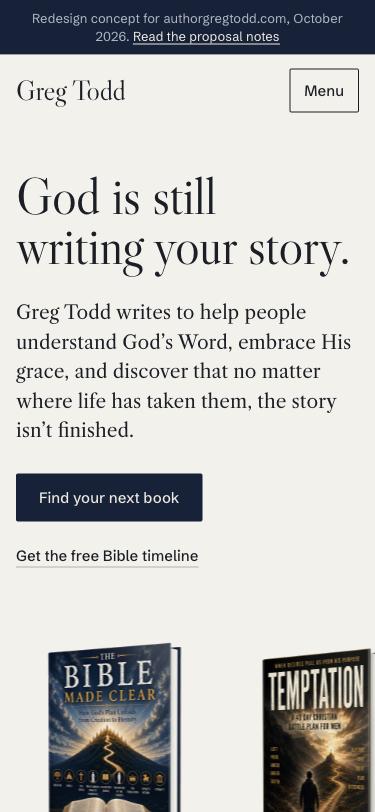
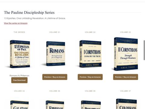
Fix this week
These don’t need a redesign. Each one is a moment where a reader, a pastor or a bookstore buyer decides the site isn’t looked after.
-
“About Greg” is a dead page
Top menu on every page. /about-greg shows “Page Not Found. No page is linked to this domain.”
FixPublish an About page, or point the link at the story section of the homepage until one exists.
-
A free workbook link leads to the same dead page
“Temptation, Leader Study Workbook” in the Free eBooks menu and its “Download Now” button both go to /landing, which doesn’t exist.
FixPoint both at the working sign-up form, or remove the offer until it works.
-
An internal QA note is visible to readers
Inside the preview pop-ups for the Bible Made Clear Participant Guide and the Temptation Leader Workbook:
“…signup routing still needs a controlled check.”
FixDelete the sentence from both pop-ups.
-
The newsletter page is titled for another business
The free Participant Guide sign-up page shows “Free 30-Minute Marketing Strategy Session — Meridian Growth” in the browser tab and in bookmarks.
FixRename it to “Free Bible Made Clear Participant Guide, Greg Todd”.
-
Search results show the builder’s placeholder
The homepage description reads “View this page published on www.authorgregtodd.com.” Google and Facebook link previews show this.
FixWrite a real description that names the books and who they’re for. The concept uses one you can copy.
-
The menu changes from page to page
On the Contact page the “Free eBooks” menu disappears.
FixUse one shared header on every page.

What the design is costing
No type system
Times New Roman (hero), Raleway (mission), EB Garamond (button), Helvetica capitals (name), Alegreya Sans (menu), Arial (Free eBooks menu) and Georgia (pop-ups). The hero font isn’t even loaded; it falls back to the computer’s default.
ProposedTwo families with a reason each: Caslon for reading and headlines, Schibsted Grotesk for buttons and menus.
The homepage is a dead end
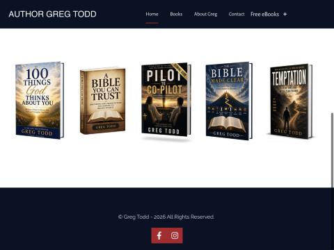
Five covers with no titles and no links, then one “Explore Books” button. A visitor can’t tell which book is for them.
ProposedA shelf where every cover links to its book, then a contents page that starts from the reader’s question.
Greg is missing from his own site
No photo, no bio and a broken About page. His strongest story, 30 May 1999, is hidden in a pop-up for an unreleased book.
ProposedA dedicated story section with the date, the five turns of the story and a portrait.
Free guides are hidden
Four good lead magnets sit behind a “Free eBooks +” menu. There’s no sign-up on the homepage.
ProposedOne form, the guides listed with covers, readers choose which ones they want. The timeline PDF stays a direct download.
The Pauline series reads as unfinished
Nine identical “Coming soon” labels in a grid of thirteen.
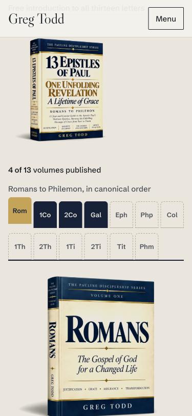
ProposedThirteen Bible thumb tabs, Romans to Philemon. Four are filled in and the rest are dashed, each with “Notify me”. The gaps now show that the series is in progress.
Heavy and hard to scan
About 4.2 MB on first load, two competing H1 headings, and centered body text over a photo.
ProposedNo background video, sized cover images, one H1 and left-aligned reading text.
The direction: a reference Bible
Greg’s readers already know how to use a study Bible. The site borrows its parts instead of a startup template, so it couldn’t belong to anyone else.
Thumb-index tabs
The edge of the page carries cut tabs, like the edge of a Bible: Begin, Books, Paul, Story, Free, Write. The tab for the section you’re reading slides out in gilt. On a phone, the menu uses the same tabs.
The reference margin
Every section has a narrow margin with a King James verse, set like a cross-reference with its verse number in rubric red. In the books section, the margin becomes the local index.
Thirteen epistles, thirteen tabs
The Pauline series is a row of Bible tabs that fills in as volumes are published. Readers can see the progress, and each unwritten volume collects emails for its release day.
#F3F1EBThin Bible paper. The ground.#1B1E26Body text.#14213AThe navy of his Pauline and Bible Made Clear covers.#9E2A20Red-letter. Only for verse references and errors.#C9A24AThe gilt page edge. Tabs and one button. Never a gradient.#EDE9DFText and plates on leather.Who’s the pilot?
Libre Caslon DisplayHeadlines only. Caslon’s types set much of 18th-century English printing, the era of the 1769 King James text Greg writes about in A Bible You Can Trust.
Study to shew thyself approved unto God, a workman that needeth not to be ashamed, rightly dividing the word of truth.
Libre Caslon TextReading text at 18px. It’s the same Caslon drawn for screens, so long book descriptions stay comfortable.
Buy on Amazon Read a sample Notify me
Schibsted GroteskButtons, menus and labels. A newspaper house’s grotesk: plain and editorial, not a startup default like Inter or Poppins.
No italics, anywhere. Emphasis comes from weight, size and the rubric color. The italic accent word is one of the most common signs of an AI-generated page, so this design leaves it out.
What we borrowed, and what we left
References from shipped sites on Mobbin. We took structure and behavior from each one, not its look.
| Reference | What it does | What we took |
|---|---|---|
| Shopify Editions | Covers stand on a real shelf with a dated index underneath. | The hero shelf, and the 13-volume row as a visible index. |
| Faculty Department, publications | Books shown as physical objects, with a plain caption under each. | Real cover renders on the paper, with title and format underneath. No cards. |
| Faculty Department, hero | The book itself is the hero image. | Greg’s books replace the stock photo. |
| Büro | A company story told as a dated chapter index. | The five turns of Pilot to Co-Pilot, with 30 May 1999 marked. |
| Kinfolk | One cover, two plain actions: Buy, Read. | Each book offers Buy on Amazon and Read a sample. Nothing else competes. |
| Kalstore | The founder’s story beside a portrait. | The story section pairs the book with Greg’s portrait. |
| Descript | Sign-up form with a plain consent line under the button. | The free-guides form says exactly what subscribing means. |
| Left out | Intercom illustrated book tiles, Patch all-caps “DOWNLOAD TODAY!” form, Daylight italic accent words. | Template tiles, shouting and italics all read as generic. |
The new homepage, in order
- The shelfHis mission as the headline, with all five books standing below it. Every cover is a link.
- Where to beginSix reader questions, each leading to the right book: “Why do I keep losing the same battle?” leads to Temptation.
- The booksEach book with its guides and workbooks, Buy on Amazon, Read a sample, or Get it free.
- The Pauline SeriesThirteen tabs. Published volumes link to Amazon; the rest collect release-day emails.
- His story30 May 1999, Who’s the pilot?, the five turns, the cover and his portrait.
- Free guidesOne form for every free guide. The timeline PDF downloads with no sign-up.
- Write to GregChurch and group orders, questions about a book, or a note about what one meant to you.
States we designed
- Volume not out yet“In preparation”, with an email field for that volume’s release day.
- Form errorsShown under the field and specific: “That email looks incomplete. Check for a missing @ or dot.”
- SendingThe button reads “Sending…” and is disabled, so it can’t be pressed twice.
- SuccessNames the result: “Guides sent. All 2 guides are on the way to you@…”
- No guide chosen“Choose at least one guide above.”
- Missing portraitA marked placeholder until Greg sends a photo.
Next steps
1. Repair
- Publish or redirect About Greg
- Fix the /landing workbook link
- Remove the QA note from both pop-ups
- Retitle the newsletter page
- Write the homepage description
- Use one menu on every page
2. Rebuild
- Agree on the direction in this concept
- Build the homepage, then a page for each book and an About page
- Connect the forms to Greg’s email list (the current PDFs are hosted on Mailchimp)
- Check that every Amazon link and sample opens
3. From Greg
- Two or three portrait photos
- Reader reviews he has permission to quote
- Formats available for each book
- Expected order and timing for Ephesians to Philemon